An Exclusive Tour of the (Not-Yet-Built) Harold and Bibby Alfond Center for Health Sciences
Your tour guide: Jennie Aranovitch
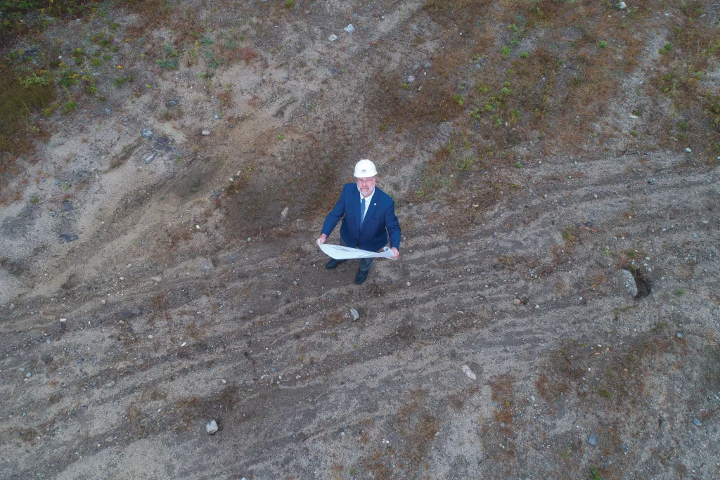
By the time this issue of the UNE Magazine is in print, the backhoe will likely be rumbling and the dirt flying on the Portland Campus. The much-talked-about Harold and Bibby Alfond Center for Health Sciences — or what many have been referring to for months as the “new COM building” — will have, at last, started to become a reality.
For the past year, members of the UNE Community have learned all sorts of facts about the building: it will be 110,000 square feet; it will cost an estimated $93 million; and, most importantly, by uniting UNE’s medical school with its other health professions programs on a single campus, it will create a completely integrated health care campus that is truly unique to the region.
We’ve also learned that this building, while it will be the new home to UNE’s College of Osteopathic Medicine (COM), will not be exclusively a COM building. In the true spirit of collaboration and collegiality, the center will serve all of the University’s health professions programs, launching UNE to new heights in its national leadership in interprofessional education.But what, exactly, is this new building going to be like? What are its features, floor plan, vibe? Those outside of the COM community and those not intimately involved in the planning process may only have a vague idea. So hop aboard this magazine tour and find out what’s in store for us come summer of 2024.
Location and Structure
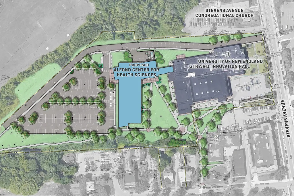
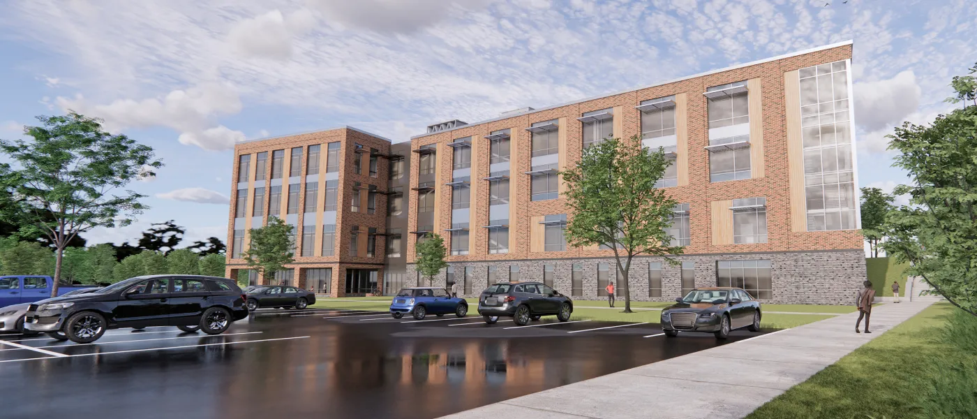
With a 15-foot difference between the upper level and the lower level of the construction site (the area behind Innovation Hall, which encompasses a hill), the Harold and Bibby Alfond Center for Health Sciences will comprise three stories that are visible from the southern campus-core side of the building and a lower level that will be partially tucked into the hill and accessible through a west- side entrance. The building will be roughly shaped like a backwards “L” with the foot of the “L” extended by a narrow glass walkway at ground level that connects the building with Innovation Hall.
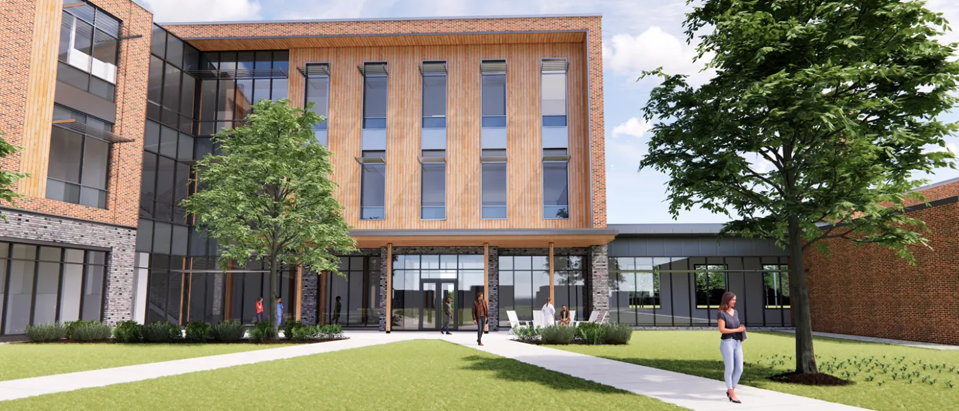
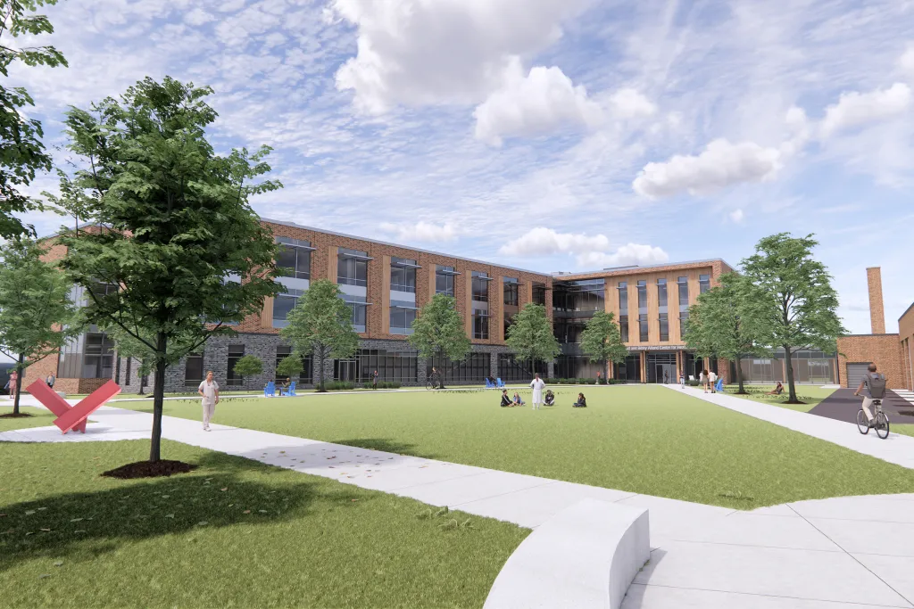
The two wings of the “L” will form two borders of a spacious, green courtyard area, perfect for relaxing, studying, and socializing in nice weather.
At the point where the walkway connects with Innovation Hall, there will be a grab-and-go café, similar to the one in Parker Pavilion. UNE’s Vice President for Operations Alan Thibeault says that the connector and the café were located with the mingling of COM, Westbrook College of Health Professions (WCHP), and College of Dental Medicine (CDM) students in mind, with the hope that freshly prepared foods and inviting spaces to sit on either end of the connector will result in students from the colleges crossing paths and sharing space.
Courtyard Level


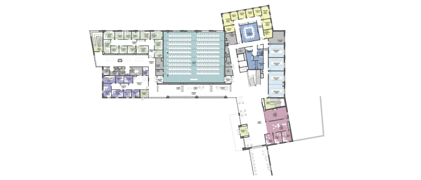
Whether you enter the courtyard level through the courtyard entrance or through the connector, you will encounter a vast lobby with a centrally located staircase, restrooms, and elevators as well as a row of four interactive group rooms, which will allow expansion of the team-based COM curriculum. Immediately before you will be the new interprofessional education suite, purposely located in the central hub of the building and immediately adjacent to the point at which the connector to Innovation Hall meets the new building. “We put it there so that everybody is going by it,” Thibeault explains. “It’s an interprofessional location that will draw WCHP, CDM, and COM students to walk past it.” Capping the wing will be the Academic Affairs suite.
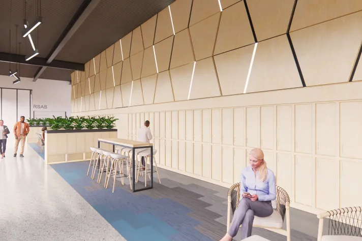
You will enter the second wing either through a corridor with soft seating areas partially partitioned by half-walls of student lockers or through an immense lecture hall that will seat 226 students. Beyond the lecture hall will be a suite of administrative offices, additional restrooms, changing rooms, and a lactation room.
Third Floor
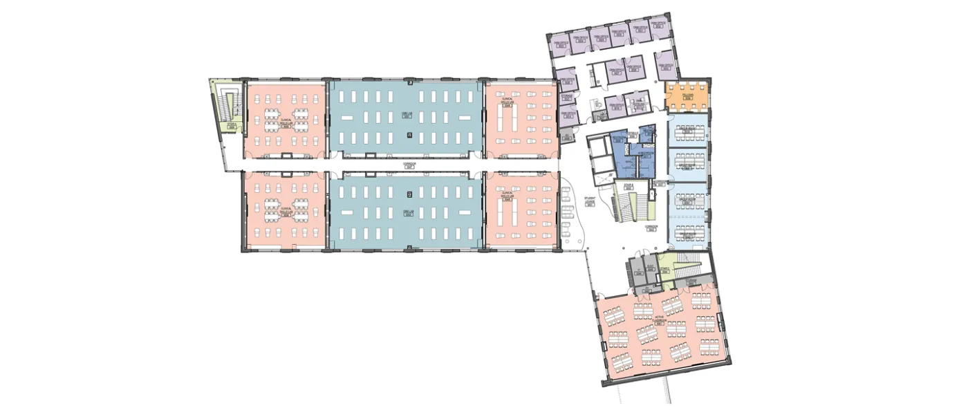
When you emerge from the stairwell onto the third floor, you will find a large “active classroom” with portable furniture that will primarily be used by WCHP classes. Another row of interactive group rooms, the OMM faculty suite, teaching pods for OMM, and clinical skills training pods complete the floor.
Fourth Floor
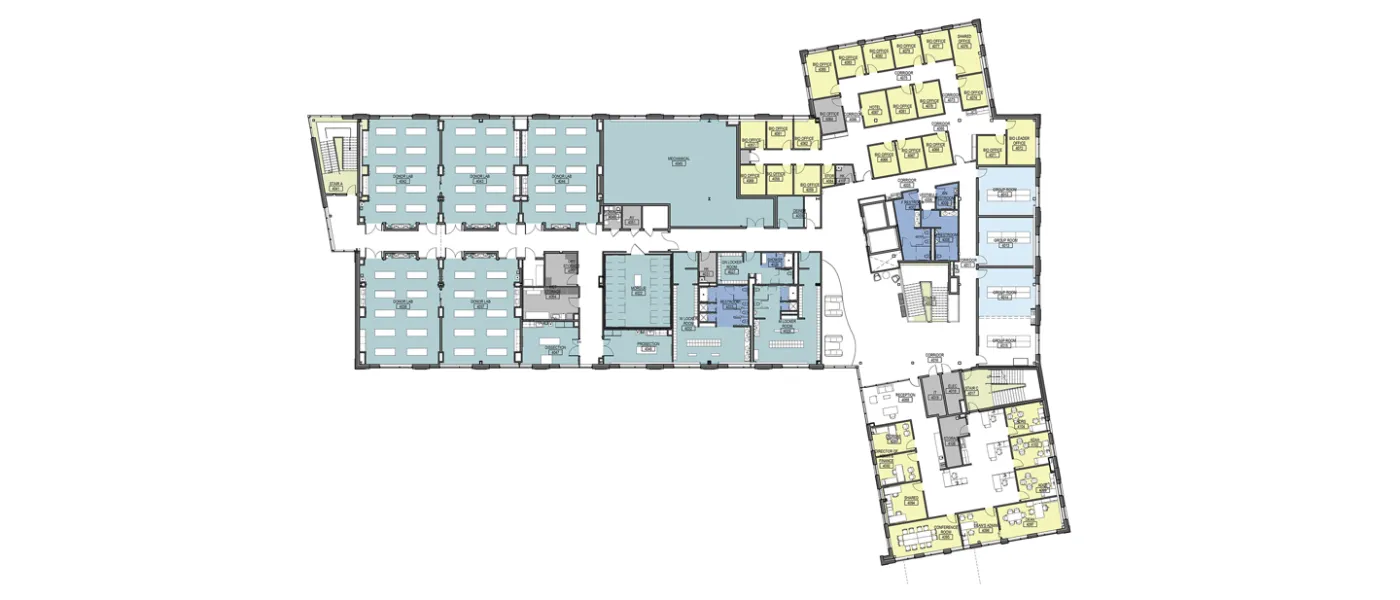
The fourth floor will bring you to the dean’s suite, four additional interactive group rooms, Medical Biology faculty offices, and, in the second wing, the donor lab teaching pods, a morgue, prosection and dissection labs, and women’s, men’s, and gender-neutral locker rooms.
Convenience Factor
When describing the new building, a word that trips off of Thibeault’s tongue quite frequently is “convenient.” Convenience, in fact, seems built into every nook and cranny of the building. It’s a luxury, says COM Dean Jane Carreiro, D.O. ’88, that comes with the advantage of years spent accumulating a wish list of features. “Every year we do a facilities survey, asking the faculty, students, and staff what they like about the facilities and what they don’t like … So we had this running list,” she explains. “When the Alfond gift was announced, I created several working groups, and I asked them, ‘Think about 10 years from now. What kind of space do you want to be in? What do you want to be doing in it? What should it look like?’”
When the Alfond gift was announced, I created several working groups, and I asked them, ‘Think about 10 years from now. What kind of space do you want to be in? What do you want to be doing in it? What should it look like?’” — Jane Carreiro
From lockers for each COM student in which to store books and personal items, to a food prep/storage station in the student lounge, to the glass walkway that is as handy in inclement weather as it is conducive to facilitating interprofessional mingling, to the showers available in the fourth-floor locker rooms, and a courtyard-level reflection/prayer room, the building hits the mark in providing students all the little things that make life easier.
The conveniences afforded by the new facility are not restricted to creature comforts, however. Many of the features were designed with ease of teaching and collaborative learning in mind. The inclusion of the four clinical skills pods is a major upgrade, providing proper spaces for students to learn procedures, such as taking blood pressure, suturing, or drawing blood. The fact that the fifth donor lab pod is dedicated to non-COM health professions is of great benefit as well. Because COM students use cadavers in different ways than do students from other health professions, having a dedicated pod for the other programs reduces the need to move bodies around, which prevents damage to cadavers that are often in delicate states.
The use of pods in general (for all the labs, including simulated patient and OMM labs) allows faculty to work closely and consistently with a specific group of students, helping them to longitudinally develop skills and knowledge. It is also a useful way of breaking up space, thereby keeping down the noise level from multiple simultaneous conversations. “When you get a 100-some-odd people all together in one space talking over each other, it gets really, really loud,” Thibeault says when explaining the choice of layout.
Even the large, undivided rooms are designed with purpose: to maximize collaboration. The massive lecture hall sports a tiered floor plan with two rows of fixed tables and castered chairs per tier, easily allowing students to work with their neighbors, and the interactive classroom features furniture on wheels to allow for a wide variety of configurations conducive to teamwork.
There are some truly practical conveniences in the building plan as well. The fourth-floor morgue enables the storage of cadavers for future use. Furthermore, with a front-back elevator (separate from the passenger elevator) whose rear door leads to the “back of the house,” the transport of cadavers into the building is easily accomplished without traversing much public space, which is especially important given that the building houses a publicly utilized clinic.
Aesthetics and Ambiance
As for the physical appearance, it’s safe to say that the building promises to be stunning. The wing that makes up the foot of the “L” will be constructed with gleaming wood. With a wood ceiling and exposed wood beams and columns, the building, Thibeault says, “is going to be beautiful: a nice, warm environment.” Moreover, because most of the exterior walls of the wings that run along the courtyard side of the building are made of glass, there will be an abundance of natural light flowing in. The large glass expanses will also provide a glimpse of the bustling activity within for those outside in the courtyard. “This is going to be a highly active space, and that activity will be seen from the courtyard,” he explains. “You’ll see people coming and going, people gathered in the soft seating areas eating, studying together, or talking.” It will be a sight to behold, particularly at nighttime. “You can just imagine this all lit up after nightfall,” Thibeault says wistfully. “It’s going to be gorgeous.”

According to Carreiro, the building’s aesthetics and atmosphere are highly intentional. “What we hear from virtually all the students is when they came to the Biddeford Campus to visit and they saw the campus space with the trees, and the grass, and the water, that’s what made them come to UNE because it kind of screamed, ‘Health’ at them with a big ‘H.’ And the faculty and the staff feel the same way,” she says. “So that became really important in this process. How do we create that sense of the natural world and being environmentally aware while you’re in a building?”
She says that the individual working groups tasked with putting together a request list for the building came up with a handful of asks that were identical across the board. That list included being able to see nature from inside the building, for it to feel warm and homey, for there to be natural fibers in it, and for it to facilitate ease of communication among students, faculty, and professional staff. “So we gave those wishes to the architects right at the beginning, and that kind of set the stage for having areas where you could gather together but also places where you could be quiet and work, lots of light, the natural wood, the big windows, all of those things,” Carreiro enumerates. “So that became the foundation, the kind of theme, of the building.”
Assuming all goes as planned, that foundation sounds like a solid one that will support the building — and the programs that use it — for many years into the future.
Bonus Content: Floor Plans
